In this class you will learn about hierarchical models. Hierarchical models are defined by having one or more parameters that influence many individual measurements. Imagine if you had many individual observations from different systems (e.g., galaxies, or people, or countries) and each of those measurements were very noisy. Now let us imagine that there is some underlying parameter — or rather, a population parameter — that influences each of the observations that you have made, but in slightly different ways. For example, each galaxy you observe might share a property with all other galaxies (e.g., a rotation curve profile) but each individual galaxy might have also have it's own offset or set of parameters.
What can we say of the population parameter from just looking at one observation? Not much. What if we can fit (or better yet, draw samples from the posterior of) the population parameter for one observation, and then repeat that for another observation, and then another? Can we build up knowledge about the population parameter then? In a sense we can, but in practice The Right Thing™ to do is to sample all of the observations at once, and infer both the population parameters and the individual parameters at the same time.
That's hierarchical modelling. Hierarchical modelling is great if
- you have individual observations of things;
- each thing might have it's own unknown parameters, but there is also some common information or property about all those things (that you can describe with a set of population parameters);
- and it's particularly powerful if the individual measurements you have are very noisy!
Probabilstic graphical models
As stated in the syllabus: this sub-unit is designed such that the lectures will provide you breadth on a large number of topics. For this reason, in each class I will introduce you to new tools, techniques, methods, and language, which will help you at some point in the future.
Let's draw a probabilistic graphical model. First, the basics.
- Arrows indicate a direct
Often causal. dependence. - Variable parameters
Including latent parameters. Latent parameters are those that are totally unobservable. are represented as circles. - Fixed parameters are represented as dots.
- Observations have shaded circles, or double circles.
- Plates (or boxes) indicate sets of things (e.g., of observations), or systems.
- Include all parameters, systems, and dependencies in your graphical model!
So our most simplistic straight line model from lesson one looks something like this:
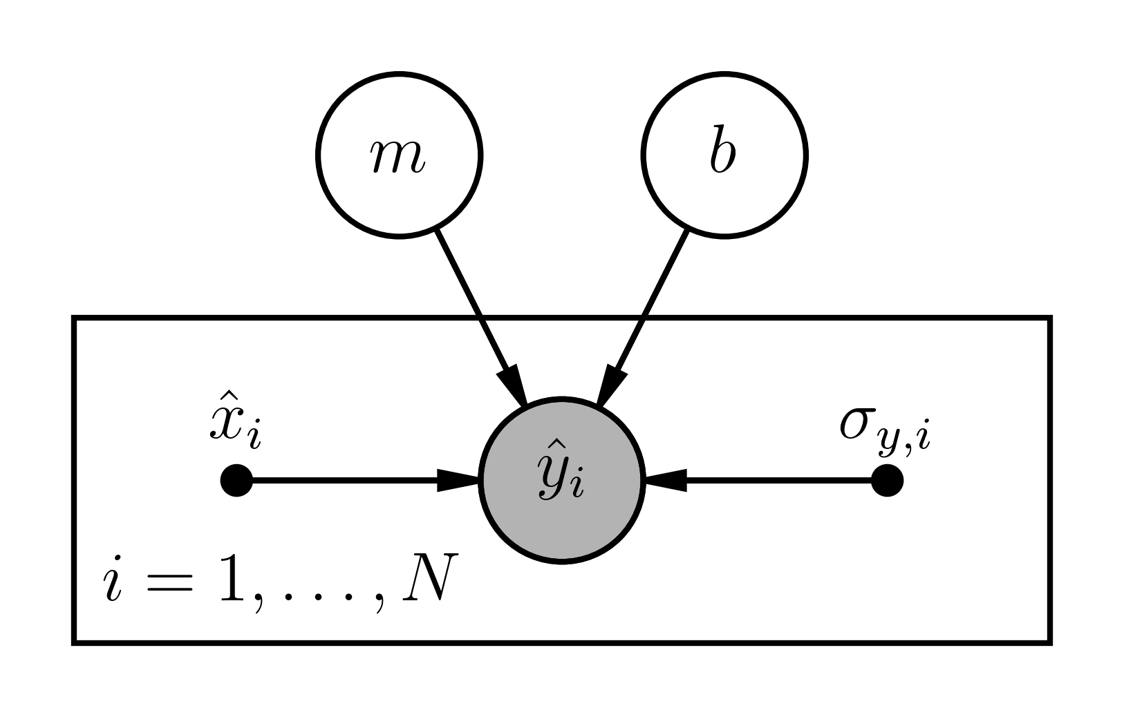
Beautiful!daft
If you're interested, we produced this in Python using the following code:
You should consider drawing probabilstic graphical models for some of the models we considered in later classes! Drawing some will give you good intution for how to view more complex models.
Hierarchical models
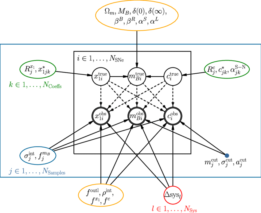
A hierarchical model could be defined by having just two levels, or multiple levels. Consider this example from The Supernova Cosmology Project
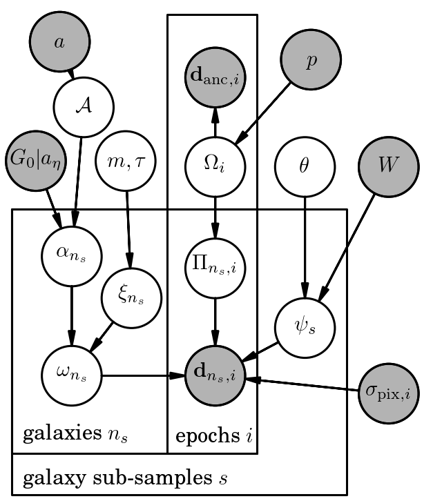
or this example for inferring cosmic shear,
Hierarchical models of this kind can be extremely challenging to optimise and sample. Optimisation becomes difficult because there are some model parameters that will have zero derivatives (or zero impact) with respect to some data, and you can easily end up with a biased result. Sampling becomes difficult for similar reasons, in that it is clear that some parameters do not generate some parts of the data, but other parts will have a significant effect. For relatively simple hierarchical models it is usually alright to still use a Hamiltonian Monte Carlo method, but for more complex hierarchical models you may want to look into Gibbs sampling.
Example: radioactive decay
A situation has emerged where a company has been producing widgets and they have inadvertedly produced radioactive material as part of their manufacturing process, and some of that radioactive material is contained in the widgets. Here is the timeline:
- The company manufactured 100 widgets over a period of 35 days.
- At the end of those 35 days the company learned that their widgets may contain radioactive material.
- Exactly 14 days after the company finished manufacturing the widgets, an investigation team was set up to measure radioactivity in all the widgets.
- Unfortunately, the widgets had been shipped so the investigation team had to go to where each widget was sent in order to estimate the radioactive material in each widget.
- Unfortunately, that meant the team was only able to measure the radioactivity levels in each widget once, and the investigation took 90 days.
- Unfortunately, the company does not know how much radioactive material was in each widget when it was manufactured. All they can give is an upper limit on the maximum possible material in each widget.
- Unfortunately, the company is also not very good at book-keeping, and they only know which day the widget was manufactured, not the exact time.
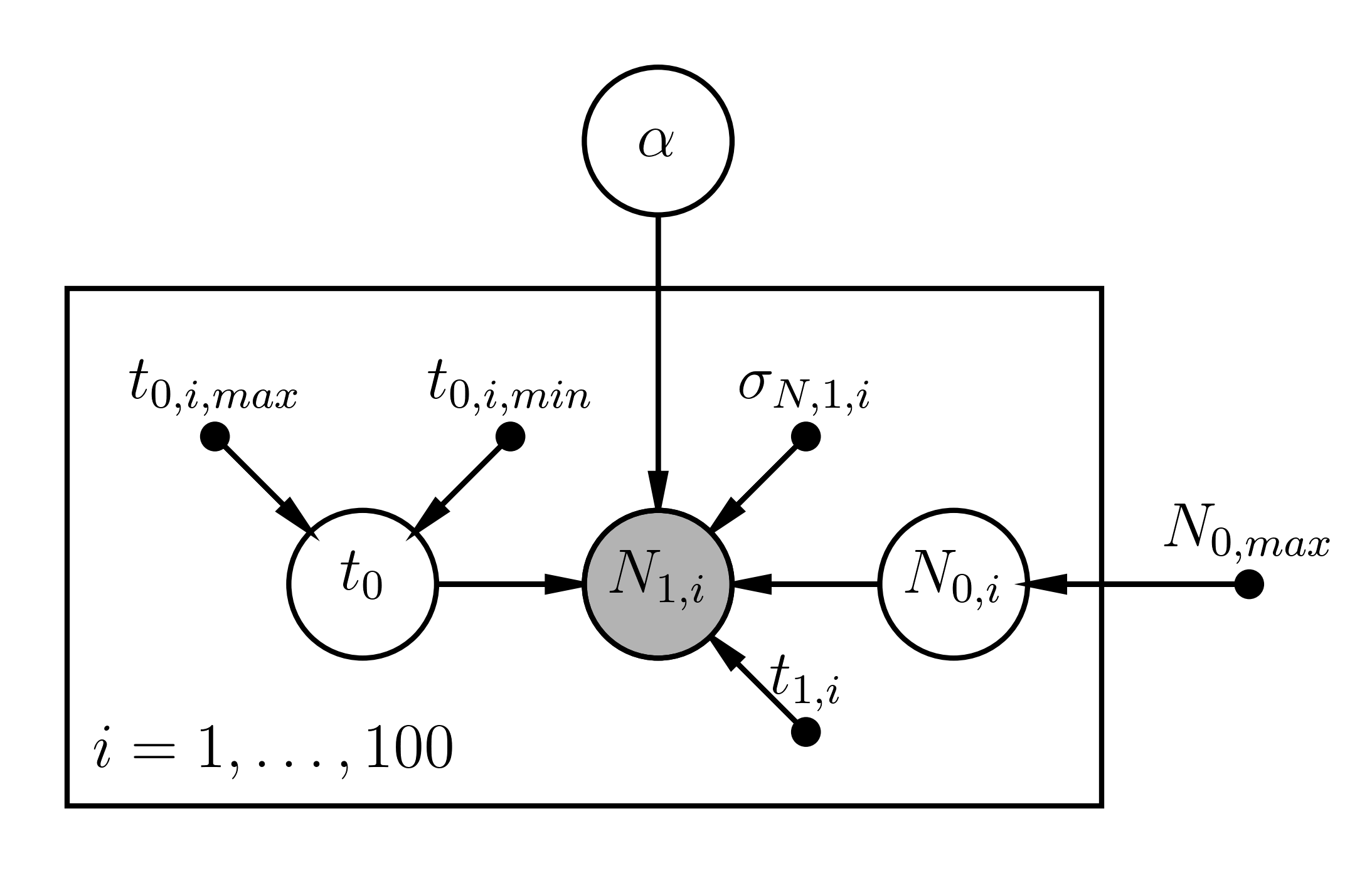
Consider this as a hierarchical Bayesian problem, and imagine that the decay lifetime of the radioactive material is described by the parameter \(\alpha\) such that the amount of material in one widget any time \(t\) is \[ N_{t} = N_0\exp\left(-\alpha\left[t_1 - t_0\right]\right) \] where \(N_0\) is the amount of material in the widget when it was manufactured at time \(t_0\). The time that the investigation team estimated the amount of material in a widget is very well known (\(t_1\)), but there are many unknown parameters here. The decay rate \(\alpha\) is what we are most interested in inferring, but for an individual widget we don't know how much material was in the widget when it was manufactured \(N_0\), or the exact time that it was manufactured \(t_0\). And while there were 100 widgets manufactured, we only have a single estimate of the amount of radioactive material present at some later time.
In a hierchical framework you would consider \(\alpha\) to be a Level 0 parameter in that it ultimately affects all your observations. You would then have the set of parameters \(\{\vec{t_{0}}, \vec{N_0}\}\) for all 100 widgets, where we only have a noisy estimate of each parameter. Indeed, for the initial amount of material for the \(i\)-th widget, \[ N_{0,i} \sim \mathcal{U}\left(0, N_{0,max}\right) \] where \(N_{0,max}\) is reported by the company, and \[ t_{0,i} \sim \mathcal{U}\left(t_{0,min}, t_{0,max}\right) \] where \(t_{0,min}\) is the start of the manufacture date for the \(i\)-th widget, and \(t_{0,max}\) is the time at the end of that day. And naturally, the estimates of the material at time \(t_1\) also have some uncertainty.
In the end our inference on \(\alpha\) must take all of this (model and observational) uncertainty into account!
Let's start by drawing a probablistic graphical model for this problem.
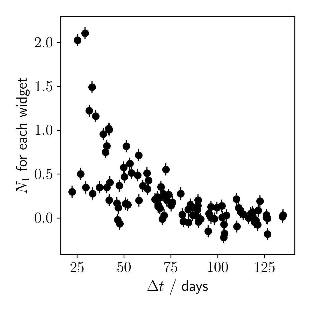
Let's generate some faux data for this problem so we can better understand how well we can model it.
Now that we have generated some data, let's plot it to make sure things look sensible.
OK, now let's build a model for the faux data. To do this we are going to use something called stan (and pystan, the Python interface to stan), which is a probablistic programming language that allows us to easily perform inference on complex models.
Just like the straight line model from week one, it is a good idea to start with a simple model and then build up complexity. Here we will assume that the time of manufacture is well-known. Once we are happy that is working, we can add complexity. For convenience we will first create a file called stan_utils.py which contains the following code:
And now let's write the stan model. Create a file called decay.stan and enter the following code:
The code here looks very simple, where things are separated into data, parameters, and model blocks. Each block is self-explanatory, and the main parameterisation occurs where we write N_measured ~ normal(..., ...);. That is to say N_measured is drawn from a normal distribution where we provide the expected mean and the observed uncertainty sigma_N_measured. You can also see that we place a constraint on alpha that it must be positive, and that N_initial (for all widgets) must be between 0 and N_initial_max. That's it.
How do we perform inference with this model? Like this,...
By default stan uses the BFGS optimisation algorithm (with analytic derivatives computed for you!) and a dynamic Hamiltonian Monte Carlo sampler where the scale length of the momentum vector is automatically tuned. You should now have samples for all of your parameters (do print(samples) to get a summary), and you can plot the trace and marginalised posterior of individual parameters:
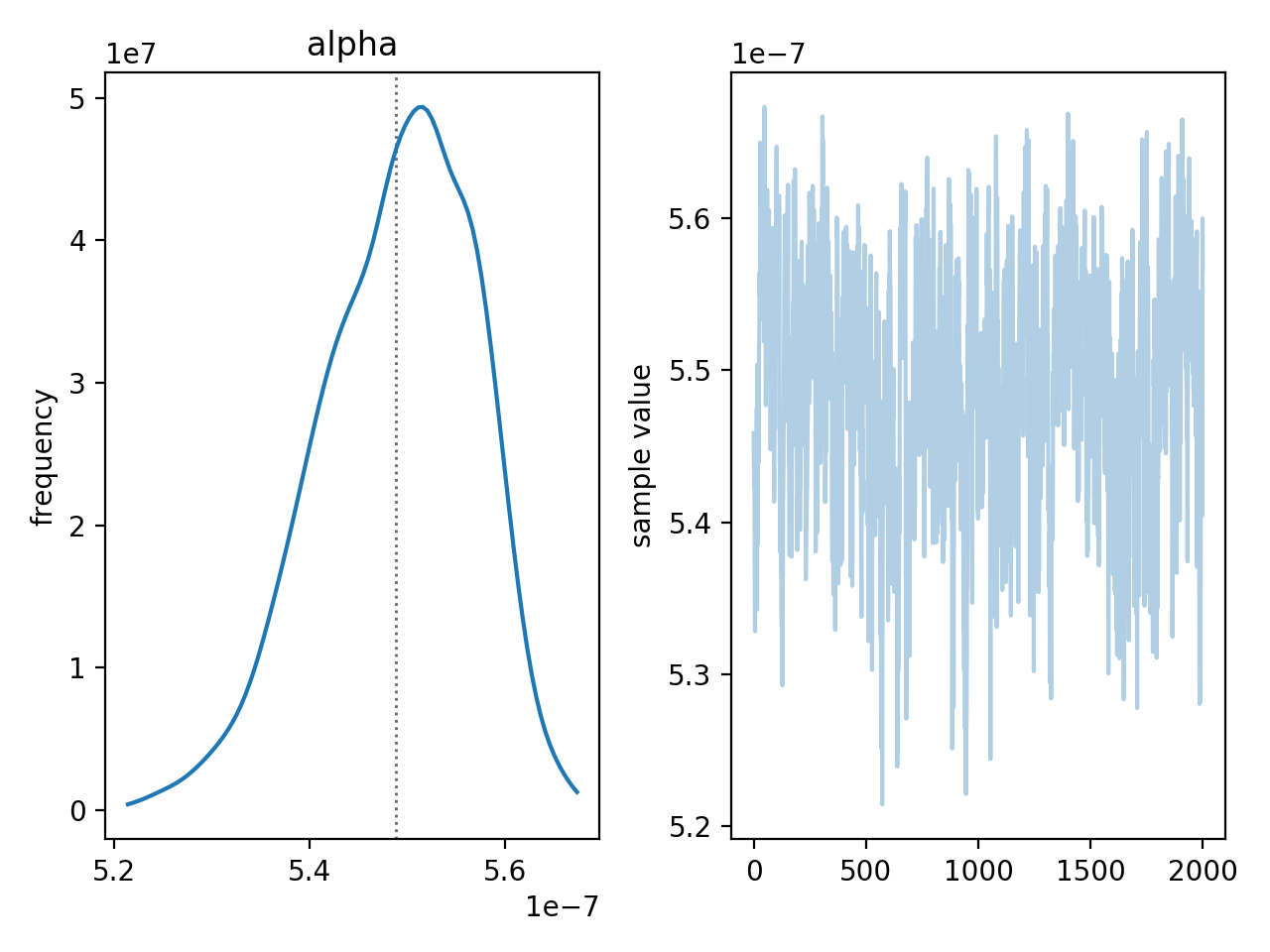
That looks pretty good! But we also have posteriors on the initial mass of radioactive material for every single widget!
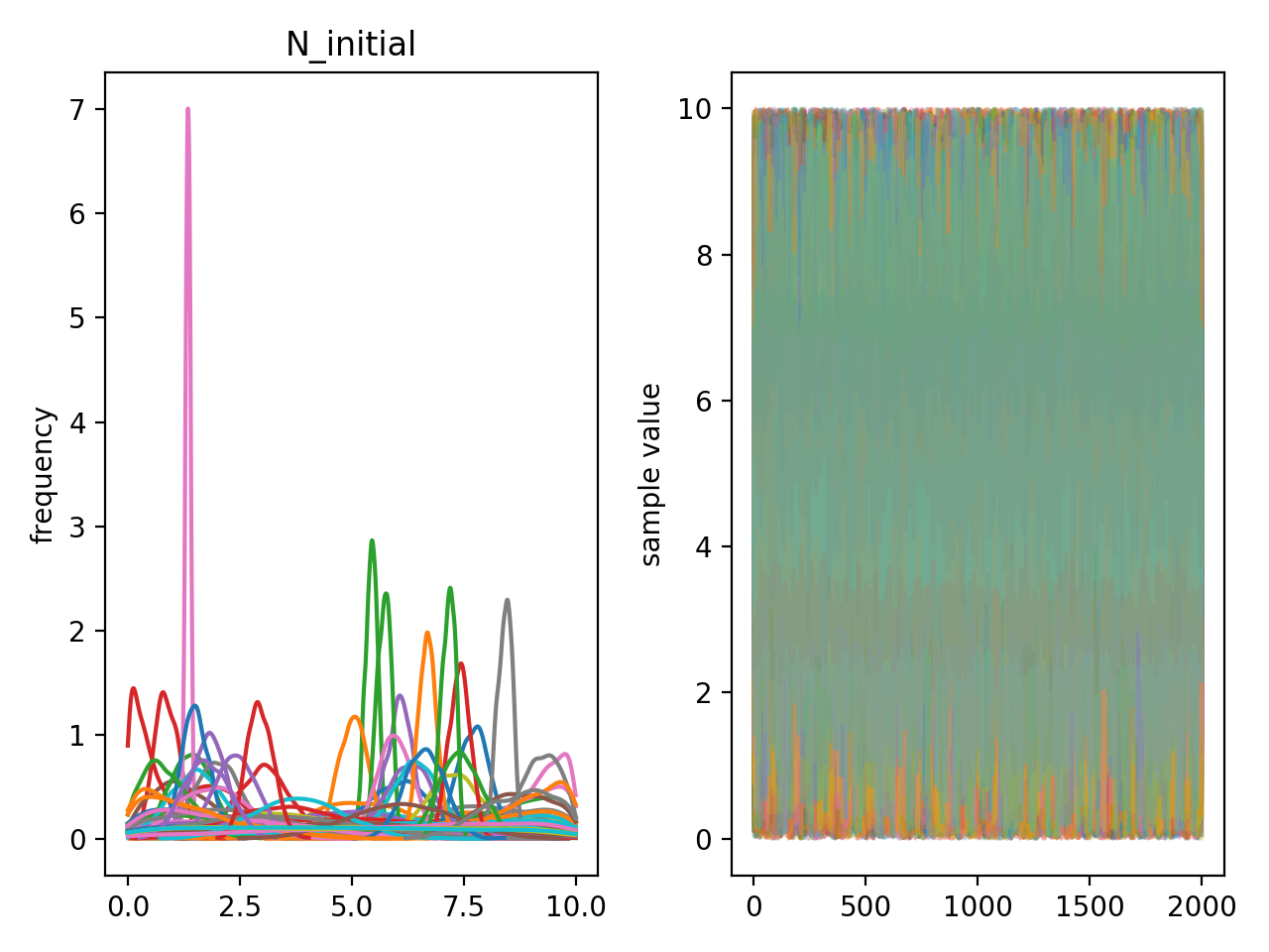
Here you can see that the initial mass is well constrained for a few widgets, but for many of them the posteriors are totally uninformative. Note that the posteriors you are seeing here are marginalised over \(\alpha\)! So even though we have 100 widgets, with very uncertain information about all of them, we can make inferences on the hyper-parameters
Example: school effects
The parallel experiments in schools example is a common one used to introduce hierarchical models.
From Bayesian Data Analysis
A study was performed for the Educational Testing Service to analyse the effects of special coaching programs on test scores. Separate randomised experiments were performed to estimate the effects of coaching programs for the SAT-V (Scholastic Aptitude Test-Verbal) in each of eight high schools. The outcome variable in each study was the score on a special administration of the SAT-V, a standardized multiple choice test administered by the Educational Testing Service and used to help colleges make admissions decisions; the scores can vary between 200 and 800, with mean about 500 and standard devation about 100. The SAT examinations are designed to be resistant to short-term efforts directed specifically toward improving eprformance on the test; instead they are designed to reflect knowledge acquired and abilities developed over manh years of education. Nevertheless, each of the eight schools in this study considered its short-term coaching program to be successful at increasing SAT scores. Also, there was no prior reason to believe that any of the eight programs was more effective than any other or that some were more similar in effect to each other than to any other.
The results of the experiments are summarised in the table below. All students in the experiments had already taken the PSAT (Preliminary SAT), and allowance was made for differences in the PSAT-M (Mathematics) and PSAT-V test scores between coached and uncoached students. In particular, in each school the estimated coaching effect and its standard error were estimated
| School | Estimated treatment effect, \(y_j\) |
Standard error of effect estimate, \(\sigma_j\) |
|---|---|---|
| A | 28 | 15 |
| B | 8 | 10 |
| C | -3 | 16 |
| D | 7 | 11 |
| E | -1 | 9 |
| F | 1 | 11 |
| G | 18 | 10 |
| H | 12 | 18 |
How would you evaluate the efficacy of the treatment? How would you model it? What parameters would you introduce? Can you draw your graphical model?